POS Flutter ・ UI 對齊進度板
這是重新逐張稽核的誠實結果:每張讀 Swift 原始碼當基準,跟現行 Flutter render(下圖)逐項比對。 🟢 = 與 Swift 對齊,🟡 = 只剩顏色/間距/字串/圖示等細節小差,🔴 = 缺整個區塊/分頁/功能。 2026-06-22:修完全部 24 個🔴大缺 + 跑三輪小差修補,每步重截+重稽核。 目前 🔴 大缺 0。剩 🟡 多為 SF Symbol↔Material icon 形狀等平台本質細節。
🟢 對齊 106🟡 小差 29🔴 大缺 0共 135 張
① 登入 / 選餐廳 🟢0 🟡2 🔴0

🟡 小差登入頁
login
Swift:SignInView: background gradient (background→secondary.opacity(0.3)), header (fork.knife.circle.fill or logo image up to 220x220 + 'ChefsMate' largeTitle bold + optional welcomeMessage subheadline), 3 OAuth buttons (Apple black / Google / LINE green), divider '或' + collapsed email link OR 3-step emai
缺口 2 項
- Logo not visible in gallery render: assets/login_logo.png is not bundled in the gallery build, and the fallback ShaderMask+Icons.restaurant_menu also fails to render, leaving a large blank space in the top half. Code fallback path is correct. Swift shows fork.knife.circle.fill with primary gradient clearly.
- Subtitle '智慧點餐系統' is hardcoded in the Flutter header (always visible). Swift only shows the subtitle when the optional welcomeMessage param is provided. Minor divergence; in production the param will be passed in.

🟡 小差選擇餐廳(active / 審核中 / 停權)
restaurant-select
Swift:WorkspaceSwitcherView: NavigationStack inline title '選擇餐廳', 完成 top-right; ScrollView+LazyVStack spacing 12 / horizontal padding 16 / top padding 16; each card HStack spacing 14 — 44×44 icon (cornerRadius 12, primary fill if selected else primary.opacity(0.12)), name (headline) + subtitle (caption),
缺口 1 項
- Flutter uses StitchColors.borderLight for non-selected card border; Swift uses StitchColors.border. Both tokens are subtle gray separators — functionally equivalent but the lighter token may produce a barely-visible border in some themes.
② 主控台 🟢0 🟡2 🔴0
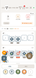
🟡 小差主控台(桌況 + 統計 + 營收條 + FAB)
main-control
Swift:主控台直向佈局:頂部 Tab Bar → 統計卡(空桌/未出完餐/未結帳 3 欄 + 供餐倒數膠囊 + 暫停接訂位按鈕)→ 即時營收條 → 暫停接單橘色 Banner(條件顯示)→ 零用金不足橘色 Banner(條件顯示)→ 按樓層分組桌位格(含縮放按鈕)→ 可拖拉底部抽屜(訂位/候位分頁 + 訂位圓圈);左下角 FAB 堆疊(星星+拆桌)、右下角出店按鈕浮在 ZStack。
缺口 4 項
- 左下角「拆桌」FAB 形狀不符:Swift 用 Circle(56pt 圓形),Flutter 用 BorderRadius(16) 圓角矩形(rounded-square)。
- 左下角「拆桌」FAB 圖示不符:Swift 用 SF Symbol square.split.2x1,Flutter 用 Icons.splitscreen(截圖顯示為「日」字形)。
- Swift 有獨立的 posPausedBanner(全幅橘色橫幅,顯示「今日已暫停接訂位/候位」+恢復按鈕),Flutter 無此橫幅元件;暫停狀態僅靠統計卡內的按鈕文字切換反映,缺少明顯橫幅警示。
- Swift 有 pettyCashLowBalanceBanner(零用金不足橘色橫幅,含「補錢」按鈕),Flutter 完全無對應元件。
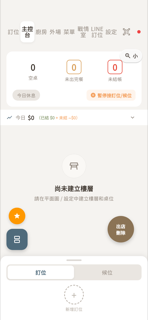
🟡 小差主控台(尚未建立樓層・空狀態)
main-control-empty
Swift:主控台空狀態由上到下:頂部膠囊 Tab Bar、統計卡(3 欄空桌/未出完餐/未結帳 + 供餐倒數膠囊 + 暫停接訂位按鈕)、營收條(今日 $0)、空樓層提示(white surface 卡、square.grid.2x2 icon、尚未建立樓層、請在樓面設計中建立樓層和桌位)、縮放按鈕(右上)、浮動按鈕(左下橘星星+藍拆桌、右下棕出店刪除)、底部抽屜(拖把手+訂位|候位 segmented+虛線圓+新增訂位)。
缺口 3 項
- 空狀態 icon 不同:Swift 用 square.grid.2x2(格狀網格 icon),Flutter 用 table_restaurant_outlined(桌子 icon)。
- 空狀態副標題文字不同:Swift「請在樓面設計中建立樓層和桌位」,Flutter「請在平面圖 / 設定中建立樓層和桌位」。
- 空狀態容器:Swift 在 white surface 圓角卡(POSColors.surface, cornerRadius 14)內顯示,Flutter 的 StitchEmptyState 直接渲染在灰色背景上,沒有白色卡片包覆。
③ 點餐 🟢3 🟡2 🔴0
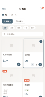
🟡 小差點餐畫面(菜單格)
ordering
Swift:點餐菜單格畫面:桌資訊列→預約獎勵banner→單點/套餐切換→分類膠囊→搜尋欄→自適應菜單格(含套餐標籤、數量badge、剩餘供應、售完遮罩、素食標籤、stepper)。
缺口 3 項
- 分類膠囊未顯示品項數量:Swift 每個 chip 後面有 '(count)'(如「全部(6)」),Flutter 只顯示名稱,缺少括號數字。
- 圖片高度略低:Swift isCompact 模式圖片高 140pt,Flutter _imageArea 固定 116pt(差 24pt,視覺上圖略矮)。
- AppBar 多一個「結帳」文字按鈕(onCheckout callback),Swift 工具列只有「取消」+購物車圖示,沒有獨立結帳按鈕在 ordering 頁。
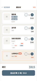
🟡 小差購物車(全螢幕)
cart
Swift:全螢幕購物車:NavBar(返回點餐/清空)+ 品項列(縮圖/品名/選項標籤/套餐更換/加購差價)+ 數量 stepper + 小計 + 加購優惠橙色卡片區 + 你可能還想加 primary 卡片區 + 底部總計/送出大鈕。
缺口 2 項
- Swift 手機版 stepper 按鈕尺寸為 40×40pt(isCompact ? 40 : 32),Flutter gallery 固定 32×32pt,按鈕偏小
- Swift 底部結帳列最上方有獨立 Divider() 元件,Flutter 改用 Container border-top;視覺相近但嚴格說構造不同
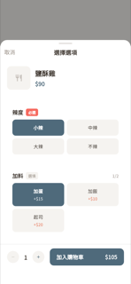
🟢 對齊客製選項 sheet
menu-option-sheet
Swift:客製選項彈窗:NavigationStack(取消+標題「選擇選項」)、品項標題列(縮圖/品名/原價)、各選項卡(必選紅牌/選填灰牌、多選計數、單選多選按鈕網格、選中主色反白、加減價顯示)、底部 confirmBar(數量步進器+加入購物車$總價大鈕、必選未選時禁用)。
缺口 0 項
- (無差異)
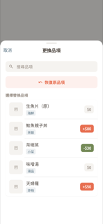
🟢 對齊套餐換品項 sheet
combo-swap-sheet
Swift:ComboSwapSheet (POSOrderingView.swift line 3484): NavigationStack sheet titled '更換品項' inline, leading '取消' (primary). Body: search bar (magnifyingglass + '搜尋品項', bg cornerRadius 10), '恢復原品項' button (arrow.uturn.backward, orange text/bg opacity 0.1, cornerRadius 10), section header '選擇替換品項' (14pt sem
缺口 0 項
- (無差異)

🟢 對齊升級套餐 對話框
combo-upgrade
Swift:iOS 原生 confirmationDialog,標題「升級為套餐更划算」+差價/套餐名說明,兩個按鈕:「升級套餐 $price」主要鈕、「維持單點」次要鈕。
缺口 0 項
- (無差異)
④ 出餐控台 🟢2 🟡1 🔴0
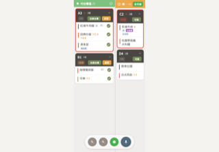
🟡 小差出餐控台(依座)
kds-expedite
Swift:雙欄出餐控台(左可出餐區 58% 綠標題 / 右準備區 42% 橘標題)。可出餐區標題列:flame.fill 圖示、標題、品數、多選切換 checkmark.circle、選取同桌 Menu、移回(N) 按鈕。準備區標題列:clock.fill、標題、品數、全部可做草綠膠囊(待有餐點才顯示)。卡片(依座):深色 header(桌號 + 急單三角 + 品道數 + 折疊箭頭 Row1;等候色階膠囊 + 全部出餐 + 稍等/可做 Row2)+ 品項列(站別色條 4px + 品名 + qty×N橘 + 急單三角 + ordererTag藍標 + 已改單紫徽章 + 備註橘 + 選項膠囊 + 座號 +
缺口 2 項
- 準備區標題「準備區」在 render 截圖中被截斷成「準…」,因「全可做」膠囊把 Flexible Text 擠掉。Swift HStack+Spacer 下三字輕鬆顯示,Flutter Expanded→Row→Flexible 在 42% 欄寬仍擠不下。可改為讓「全可做」先排、標題 Flexible 在前以保持完整顯示。
- 準備區「全部可做」按鈕文字 Flutter 縮為「全可做」(4 字),Swift 原文為「全部可做」(5 字)。字串差異。
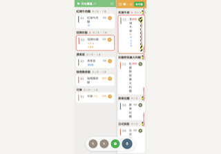
🟢 對齊出餐控台(依品)
kds-expedite-perdish
Swift:依品模式單品列卡(_PerDishCard):多選勾選框、站別色條、桌號、品名+數量(橘)+急單三角+點餐者藍標膠囊、備註(橘)、選項膠囊群(FlowLayout 藍)、已改單紫徽章、等候時間色階、出餐按鈕(綠勾,僅可出餐區)、移動箭頭(橘右/綠左依區域)。
缺口 0 項
- (無差異)
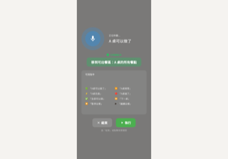
🟢 對齊語音控單 overlay
kds-voice
Swift:Full-screen black-50% overlay. Mic indicator: outer pulse circle 120pt blue-20% + inner 80pt blue-30% + mic icon 36pt (mic.fill/mic.slash.fill). HStack: mic left, right column with status label (正在聆聽.../辨識完成 caption white-70%) + transcript (title3 medium white, placeholder '請說出控單指令'). Conditional co
缺口 0 項
- (無差異)
⑤ 結帳 🟢12 🟡1 🔴0

🟢 對齊結帳大廳(全額・未結)
checkout-lobby
Swift:CheckoutSheet(POSMainControlView.swift ~5350–8849)單欄捲動 13 個 section:① 已扣會員獎勵 Banner(紫框,每筆扣點/折抵 pill,CheckoutConsumedRewardsBanner)② 貴賓摘要(avatar 圓圈+姓名+桌位/人數 Label+LoyaltyMemberInfoView compact 點數/可兌/壽星 badge)③ 結帳方式三鍵(全額 banknote/分帳 person.2/按餐點 list.bullet.clipboard,選中 primary 背景白字)④ 客人端監看按鈕(有遠端訂位 id
缺口 2 項
- 訂單摘要 section header:Flutter 用 Icons.assignment_outlined(剪貼板+線條文件),Swift 用 list.bullet.clipboard(條列清單+剪貼板)。語義一致,形狀細節有差。
- 折扣 section header:Flutter 用 Icons.sell_outlined(價格標籤,無穿孔),Swift 用 SF Symbol tag(穿孔標籤)。語義一致,形狀細節略異。

🟢 對齊結帳大廳(現金收款數字盤)
checkout-lobby-cash
Swift:現金收款內嵌數字盤(inlineCashReceive):收取金額輸入欄 + 「剛好 $金額」整顆全幅主色按鈕 + 台灣常用面額 3 欄建議格(各含找零預覽)+ 應找零警告橫條(warning 色,條件顯示)+ 取消/確認收款雙按鈕列。
缺口 0 項
- (無差異)

🟢 對齊結帳大廳(全部付清)
checkout-lobby-paid
Swift:allPaidBanner: VStack — checkmark.seal.fill (40pt green) + '全部付清' (22pt bold green) + grandTotal (18pt POSColors.text) + conditional loyaltyPointsBannerSection (star.circle.fill orange + '本次可獲得 N 點' + pointDistributions forEach白底圓角卡 + scannedMember card + qrcode.viewfinder scan button) + '傳送明細連結給客人'
缺口 0 項
- (無差異)
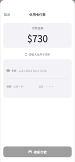
🟢 對齊信用卡付款
checkout-credit-card
Swift:固定走手動輸入模式(T2P 硬關 isT2PAvailable=false):NavigationStack inline title 信用卡付款 + 取消 leading → systemGray6 金額卡(付款金額 subheadline secondary / $整數 48pt bold / cornerRadius 12)→ info.circle + 請輸入信用卡資料(size 14 secondary)→ TPDForm 佔位 h200(卡號/分隔線/到期+CCV)→ Spacer → 確認付款按鈕(h56 cornerRadius 14 / creditcard.fill / 藍
缺口 0 項
- (無差異)

🟢 對齊線上結帳 QR(等待付款)
checkout-qr
Swift:等待付款狀態:關閉鈕(右上)+「📱 線上結帳」標題+副標+應付金額(橘 32pt)+QR Code(220×220 白卡含陰影)+等待 spinner+「分享連結」(橘)與「取消」(灰)並排按鈕;付款成功後切換至成功態(綠勾+金額+確定鈕)。
缺口 0 項
- (無差異)
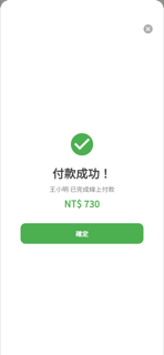
🟢 對齊線上結帳 QR(付款成功)
checkout-qr-paid
Swift:付款成功狀態:右上關閉鈕、大綠色勾圓圖示(size 64)、「付款成功!」標題、「{客人名} 已完成線上付款」副標、綠色金額(title2/22pt bold)、全寬綠色「確定」按鈕。
缺口 0 項
- (無差異)
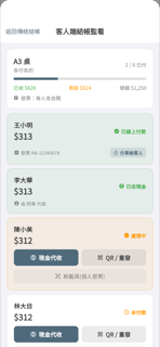
🟢 對齊客人端結帳監看
checkout-monitor
Swift:客人端分帳結帳監看 sheet:導覽列(返回傳統結帳+標題)、loading/empty 兩狀態、總覽卡(桌號/分帳模式/進度條/已收·剩餘·總額/發票模式)、全部付清 banner(關桌結帳綠底按鈕)、每位客人列(六種狀態 badge;未付三動作鈕:現金代收+QR重發+刷載具(含已綁定狀態);已付頁腳:代收員工+發票號+分享給客人按鈕)。
缺口 0 項
- (無差異)
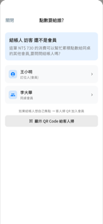
🟢 對齊點數要給誰(選會員給點)
checkout-loyalty-choose
Swift:NavigationSheet 詢問店員要把點數給哪位同桌會員:說明卡(accent 淡藍底)+ 候選人列(來源 icon + 名 + 標籤 + chevron,選取中顯示 ProgressView)+ QR Code 備援鈕。
缺口 0 項
- (無差異)
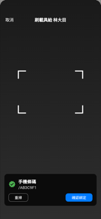
🟢 對齊刷載具(手機條碼)
checkout-carrier-scan
Swift:黑底全螢幕相機 sheet,頂部 inline 標題「刷載具給 customerName」+ 白色取消鈕,底部浮動卡片兩態:掃前 hintCard(viewfinder 圖示 + 提示文)、掃後 detectedCard(綠/黃 badge icon + 類型名 headline + 條碼 monospace + 重掃/確認綁定 按鈕)。
缺口 0 項
- (無差異)
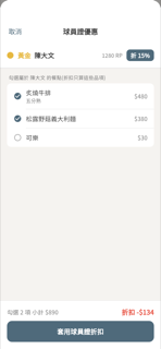
🟢 對齊球員證・段位折扣
checkout-player-card
Swift:兩段式 sheet:v1 段位折扣(掃描→驗證→勾品項→套用折扣),v2 會員優惠兌換(掃描→驗證→選優惠清單→勾品項→套用),共用抬頭列(段位色圓 + 段位名 + 球員名 + RP + 折X% badge)、品項勾選列、底部摘要列(小計 + 折扣/折抵 + 套用按鈕)。
缺口 0 項
- (無差異)

🟡 小差球員證・會員優惠兌換
checkout-player-offer
Swift:PlayerCardOfferRedeemSheet 四步驟:scan(POSQRScannerView)→ verifying(ProgressView+「驗證球員證中…」)→ pickOffer③(NavigationStack 標題「會員優惠」+取消、cardHeader 段位色圓點 16px+tierName bold 段位色+displayName semibold+RP 右側、Divider、List insetGrouped section「符合資格的優惠」、每列:title semibold 15+desc 12 textSub+kindLabel badge primary色
缺口 1 項
- Flutter _offerRow 在 kindLabel badge 右側多加 SizedBox(8)+chevron_right icon;Swift pickOfferView 的 Button label HStack 沒有明確 disclosure indicator,無箭頭。功能等效,語義可接受。

🟢 對齊訪客累積點數 QR
checkout-visitor-points
Swift:非會員結帳後 sheet:🎁 + 可累積 X 點(橘 44pt)+ 消費金額 + QR 白卡(220×220)+ 3 行說明 + 分享連結(橘)/ 略過(灰)兩按鈕。
缺口 0 項
- (無差異)
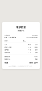
🟢 對齊電子發票圖
checkout-invoice
Swift:白底發票卡(width:380, padding:20):置中標題「電子發票」(22pt bold) + 店名 (16pt semibold, secondary) → 分隔線 → 發票號碼(等寬字體, 左)+開立時間(右)→ 買受人 → 分隔線 → 品項表(品項/數量/小計三欄標題 + 每列名稱/×qty/$小計)→ 分隔線 → 應稅金額 + 稅額(5%) + 合計(大字粗體 NT$) → 財政部免責聲明(9pt, 置中)。
缺口 0 項
- (無差異)
⑥ 關帳 / 結算 🟢9 🟡2 🔴0

🟢 對齊關帳(含現金面額盤點・整頁)
settlement-close
Swift:關帳整頁:Hero 深藍漸層卡 + 支付 4 格 QuickStats + 調整項目(折扣/優惠券/手動折扣/服務費/稅額)+ 營業統計 + 發票統計 + 訂金收入 + 現金盤點(預期算式 + 幣值/直接輸入分段 + 差異行 + 現金短缺原因必填欄)+ 營業額存入帳戶選擇 + 備註,底部 sticky 確認關帳按鈕。
缺口 0 項
- (無差異)

🟢 對齊小結(不鎖帳・整頁)
settlement-interim
Swift:SettlementSheet(小結模式):NavigationStack inline title「小結」;左上「關閉」TextButton;右上 ShareLink(square.and.arrow.up)。內容長捲:① Hero 藍漸層(dateLabel + totalRevenue + orderCount + guestCount);② QuickStats 4 格(現金/信用卡/行動支付/其他);③ 調整項目(折扣合計 + 優惠券縮排 + 手動折扣縮排 + 服務費 + 稅額,trailing net);④ 營業統計(訂單數/來客數/客單價 + 作廢/退款條件顯示);⑤ 發票統計(
缺口 0 項
- (無差異)
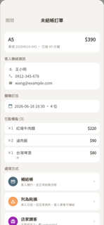
🟢 對齊未結帳訂單詳情(4 種處理)
settlement-unsettled
Swift:補關帳單筆詳情 sheet:抬頭卡(桌號/金額/單號·已過N分鐘)、客人聯絡(姓名/電話/信箱)、關聯訂位、已點餐點列表(×qty/選項/備註/$小計)、4種處理方式按鈕(補結帳藍/列為耗損橘/店家請客紫/刪除訂單紅)各附副標與 chevron。disabled 0.4 opacity 依角色權限。
缺口 0 項
- (無差異)
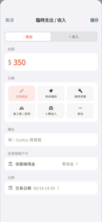
🟢 對齊臨時收支(記帳)
settlement-adhoc
Swift:Sheet 含 inline 標題「臨時支出 / 收入」、取消/儲存、Segmented「- 支出 / + 收入」、金額大字(隨方向變色)、6 格分類 chip(文具/食材/維修/員工餐/小費/其他)、備註 TextField、帳戶 Picker(標題依支出/收入動態切換)、日期 DatePicker(日期+時間)。
缺口 0 項
- (無差異)
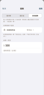
🟢 對齊退款
settlement-refund
Swift:退款 Sheet:頂部 segmented 選類型(退付款/退訂金/其他退款)+類型 footer 說明+條件區(付款ID輸入+⚠️提示、訂位 picker、帳戶 picker+footer)+金額+原因 section,導覽列含取消與退款按鈕。
缺口 0 項
- (無差異)

🟡 小差批次補關帳(整頁)
settlement-batch
Swift:BatchRetroCloseSheet: NavBar(批次補關帳 + 關閉) → Hero(橘・批次補關帳·N天/總收/訂單/位客) → QuickStats 4格(現金/信用卡/行動支付/其他) → 每日明細 SettlementSection(calendar icon·橘, 逐日卡: calendar.badge.clock icon + 日期 + 總收入 + 訂單數/來客數 + 支付膠囊現金/卡/行動) → 營業額存入帳戶 SettlementSection(building.columns.fill·藍, 資產列: icon+名稱+類型+餘額+checkmark.circle)
缺口 1 項
- 每日明細日期列圖示:Swift 使用 calendar.badge.clock(日曆帶時鐘 badge,帶有「過去/漏帳」語義),Flutter 使用 Icons.calendar_today(純日曆,無時鐘 badge)。版面與顏色正確,僅圖示語義略差。
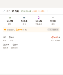
🟢 對齊即時營收條(展開)
settlement-revenue-bar
Swift:主控台頂部可摺疊營收條:收合列顯示今日總額(已結綠色+未結橘色);展開後依序呈現支付方式 4 格(現金/刷卡/行動支付/其他)、訂金收入列(橘底+不計入營業額膠囊)、客數/均消/折扣(可點擊開折扣明細 sheet)、以及服務費/稅金/退款選填列。
缺口 0 項
- (無差異)

🟢 對齊漏關帳警告橫幅
settlement-missed-banner
Swift:橘漸層橫幅:⚠️ 實心三角圖示(size 16)+ 文案(14pt semibold)+ Spacer + 批次補按鈕(≥2天,opacity 0.35)+ 逐日補/前往補關帳(opacity 0.25)+ chevron right,padding 16/12,Orange→#E65100 漸層。
缺口 0 項
- (無差異)
🟡 小差編輯關帳紀錄
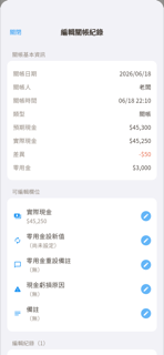
settlement-edit
Swift:DailyCloseEditSheet: NavigationStack + Form with (1) 關帳基本資訊 section (readonly info rows: date/closedBy/time/type/expectedCash/actualCash/diff(colored)/startingCash — some optional), (2) lockSection OR 可編輯欄位 section (5 editable rows: blue icon + field name + current value + pencil.circle.fill trailin
缺口 2 項
- Edit field sub-sheet (原值 / 新值 / 修改理由(必填)sections with 取消/確認 toolbar and ProgressView) is not implemented in the Flutter gallery view. Expected for a pure-display gallery widget, but worth noting for functional completeness.
- Swift conditionally shows closedBy, actualCash, cashDifference, and startingCashResetAmount rows only when non-nil. Flutter hardcodes them as always-present required params with no optional display logic.
🟢 對齊金流對帳
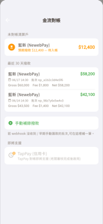
settlement-payout
Swift:四區塊 insetGrouped List:未對帳清算戶(藍新 hourglass 橘圓圈填滿)、最近 30 天撥款(processor + net 綠 + Gross/Fee/Net + 日期批次)、手動補錄撥款按鈕(綠色 plus.circle.fill + footer 說明)、即將支援(TapPay 灰色 opacity 0.55 + clock.badge.exclamationmark),navigationTitle「金流對帳」,支援 ManualPayoutEntrySheet 彈出。
缺口 0 項
- (無差異)
🟢 對齊歷史關帳挑選
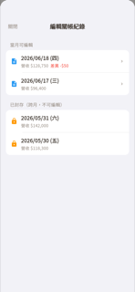
settlement-history
Swift:列出所有 final 關帳紀錄,分「當月可編輯」(藍色 doc 圖示+日期+營收+差異+chevron,可點開編輯)與「已封存(跨月,不可編輯)」(橘色 lock 圖示,無 chevron,disabled)兩區塊,全空時顯示空狀態文字。
缺口 0 項
- (無差異)
⑦ 菜單管理 🟢8 🟡2 🔴0
🟢 對齊菜單管理(單點・卡片格)
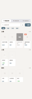
menu-management
Swift:頂部三分頁(單點菜單/套餐菜單/批量新增)切換器,單點分頁含搜尋列+分類管理+新增按鈕、橫向分類 chips、依分類分段的 4 欄卡片格(套餐橘標、售完黑遮罩、剩餘份數浮水印、素食徽章、品名、價格)。
缺口 0 項
- (無差異)
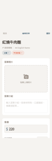
🟢 對齊編輯單點品項
menu-item-edit
Swift:ScrollView 長表單:Toolbar(取消/編輯菜單 uppercase tracking/儲存)+大字品名 TextField+廚房簡稱(plumbing icon)/EN 橫排(含 Divider)+藍色分類膠囊/橘色站別膠囊(含 dot 色彩)+照片虛線佔位卡+菜單介紹 TextEditor 卡+售價($大字)+Divider+每日限量卡+食譜與成本唯讀卡(成本+利潤率≥50%綠+info 提示)。
缺口 0 項
- (無差異)
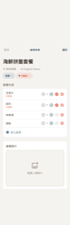
🟢 對齊編輯套餐
menu-combo-edit
Swift:套餐編輯 sheet:NavigationBar(取消/標題/儲存)+ 標題區(大字名稱、廚房簡稱/EN 行、分類藍膠囊、站別橘膠囊)+ 套餐內容卡(品項列含可更換橘標、數量 stepper、可更換 toggle、刪除、加入品項)+ 照片/介紹同卡 + 售價/每日限量卡 + 食譜與成本唯讀卡(成本、利潤率≥50%綠色、info 提示)。
缺口 0 項
- (無差異)
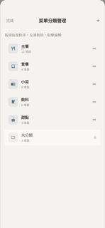
🟢 對齊分類管理
menu-category
Swift:永遠編輯模式清單:導覽列(完成/菜單分類管理/+)+說明列+可拖曳分類列(36px 圓角 icon 依名稱自動推斷、名稱 semibold、N 項目 caption、拖曳把手)+未分類鎖定列(folder icon、lock icon、surface 0.5 底色、不可拖動),無顏色或 icon picker。
缺口 0 項
- (無差異)

🟢 對齊客製選項設定
menu-options
Swift:菜單選項設定列表:NavigationStack + 關閉/+ 工具列、insetGrouped 列表,每列含狀態彩色圓點(綠=啟用/灰=停用)、名稱、必選紅標、多選藍標、選項預覽(/ 分隔)、N 項計數、chevron,支援滑動刪除與拖曳重排;有空狀態(slider.horizontal.3 圖示 + 說明 + + 按鈕)。
缺口 0 項
- (無差異)
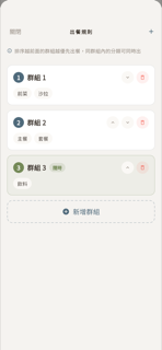
🟢 對齊出餐規則 / 順序
menu-serving-order
Swift:POSServingOrderSheet:NavBar(關閉 leading / 出餐規則 uppercase tracked center / + trailing primary)、說明條(info.circle outline + 文字)、ScrollView 群組卡(序號圓圈 primary 或 accentGreen、名稱 semibold、隨時膠囊 green、上/下/刪圓形按鈕、分類 FlowLayout Capsule 膠囊、空分類 italic 文字)、新增群組虛線圓角按鈕(plus.circle.fill + dashed StrokeStyle dash:[6])、空狀態
缺口 0 項
- (無差異)
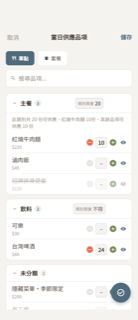
🟡 小差當日供應品項
menu-daily
Swift:POSDailyMenuSheet:取消/儲存 toolbar、單點/套餐分頁 Picker(靠左+Spacer)、搜尋欄(magnifyingglass + xmark.circle.fill 清除鍵)、套餐頁橘色 comboSupplyExplanation 資訊卡(info.circle.fill 實心圖示)、可收合分類卡(chevron + 名 + N badge primary色 + 類別限量按鈕)、展開時 business rule 文字 + 超限⚠️警告 + 預設類別份量提示 + 品項列表、品項列(名/價 + 套餐「內含:」+「可售N份」橘字 + 預設份量提示 + 數量 step
缺口 1 項
- 套餐說明卡標題 icon:Swift 用 `info.circle.fill`(填色實心),Flutter 用 `Icons.info`(輪廓空心)。語義相同、版面對齊,但 Swift 明確選用填色版本,視覺有輕微差異。
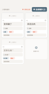
🟡 小差批量新增
menu-batch-add
Swift:頂部工具列(N 個品項待儲存 caption1/textSub + 清除全部 trash/accentOrange(cards>1 才顯示)+ 全部儲存(N) checkmark.circle.fill 白字 primary 背景,有效數=0 時變灰)。2 欄 LazyVGrid spacing:10、水平 padding StitchSpacing.s。每張卡:照片區(無照片 48pt camera.fill+上傳照片文字佔位;有照片 64pt scaledToFill + crop/xmark 半透明黑圓形按鈕)→ #N + xmark.circle.fill header → 名稱 Te
缺口 2 項
- 工具列文案:Flutter 顯示「N 個待儲存」,Swift 為「N 個品項待儲存」,少了「品項」兩字。
- 區站膠囊預設圖示:Swift 在未選區站時顯示 flame SF Symbol(size:8)+ 「區站」文字;Flutter _miniPill 只顯示 label 文字 + chevron,無火焰圖示。

🟢 對齊標記售完 + 通知客人
menu-sold-out
Swift:售完通知 sheet:NavBar 取消/寄通知並確認、說明卡(發生什麼事)、載入中、空狀態、受影響訂位清單(definitive 綠 / maybe 橘,可勾選 + 全部切換)、賣完自動暫停建議區塊(Toggle)、底部錯誤訊息,共兩種 mode(markSoldOut / reducedOversold)。
缺口 0 項
- (無差異)
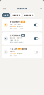
🟢 對齊加購優惠與推薦
menu-addon-deals
Swift:列表頁含導覽列(關閉/+)、篩選膠囊(全部/加購優惠/結帳前推薦含數量徽章)、每筆優惠列(狀態圓圈圖示、名稱、推薦/加購 badge、已停用 badge、加購品項名、原價→優惠價或單價、成本利潤行、觸發摘要文字、開關、chevron);空狀態另有圖示+說明+新增按鈕。
缺口 0 項
- (無差異)
⑧ 訂位 🟢14 🟡4 🔴0
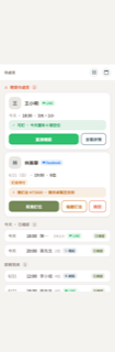
🟡 小差訂位待處理(Agenda・預設首頁)
reservation-agenda
Swift:ReservationAgendaView 分三區段:①需要你處理 — 人物卡(42×42 圓角頭像 + 名稱 bold + channel chip + 多筆徽章),每筆訂位含 cmeta(日期·時間·人數組成)、狀態 pill(已確認/訂金待付)、判斷盒(icon+文字+底色)、動作鈕群(confirmNow solid-green grow / approve solid-sage grow / reject outline-terr / markDepositPaid outline-greenT / remindDeposit outline-sandT / decline outl
缺口 1 項
- Flutter ResChannel enum 缺少 .app、.pos、.other 三個管道(Swift ReservationChannel 有這三個,全部對應 globe 圖示)。現行 Flutter channelChip 只有 line/facebook/instagram/phone/walkIn/website,若遇到 .app/.pos/.other 來源的訂位,channel chip 無法正確渲染。
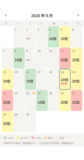
🟢 對齊訂位月曆(載客熱區)
reservation-month
Swift:月份導覽列(上個月/下個月箭頭+年月標題)+週日標(日一二三四五六)+7欄日格(日期數字、N位大字、載客率熱色背景、今日藍框、暫停圖示、假日名稱、公休標籤)+底部圖例列(<40%/40-70%/>70%/暫停/公休色塊)及長按提示文字
缺口 0 項
- (無差異)
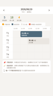
🟡 小差日檢視時間軸(桌位排程)
reservation-day-timeline
Swift:日期導覽列(chevron 左右 + 日期粗體 + 星期副標,surface 底 + 0.5px 下分隔)、統計列(總組數-primary / 總人數-accentGreen / 桌位數-warningBright)、四色圖例橫列(手動安排橘/系統安排藍/已入座灰/待確認橘紅)、時間軸格(labelWidth=78 rowHeight=52 headerHeight=32 pxPerMinute=1.8,左桌欄 + 橫向時間頭 + 依時段定位的訂位方塊,依 kind 著色,含未排桌虛擬列)、格下方安排說明框(📌手動安排/🪄系統安排/👆點選三行)、右上角 Undo 膠囊(arrow.uturn.
缺口 2 項
- 復原膠囊圖示:Swift 用 arrow.uturn.backward.circle.fill(填色後退圓圈,明確 undo 語義);Flutter 用 Icons.restore_rounded(順時針圓形箭頭,語義偏 restore/refresh)。外觀接近但 undo 語義有差。
- 空桌位空狀態(tables.isEmpty 時 Swift 顯示 table.furniture icon + 尚未設定桌位)Flutter 未實作,純呈現 widget 沒有對應 empty-state branch。

🟢 對齊客人報到
reservation-checkin
Swift:POSCheckInSheet:NavigationBar(標題+關閉)、非今日橘色警告橫幅(條件顯示)、客人資訊卡(名字/狀態徽章/人數圈/日期時間大小人)、聯絡卡(電話撥打/Email/來源/VIP)、LoyaltyMemberInfoLookup(等級/點數/生日橫幅/福利)、特殊需求徽章、備註卡(客人/內部/特殊需求三段)、智慧安排入座+手動選擇座位兩按鈕(已入座時改顯示藍色已入座卡)。
缺口 0 項
- (無差異)
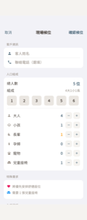
🟢 對齊現場候位
reservation-walkin
Swift:現場候位表單:客戶資訊(姓名/電話)+ 人口組成(總人數、1-6快選、大人/小孩/長輩/孕婦/寵物/條件兒童座椅 stepper + hasSpecialNeeds 時的組成摘要)+ 特殊需求 section(舒適座位/寵物友善/兒童座椅提示)+ 入座建議(可立即入座桌列含特殊屬性 badge / 候位空狀態)+ footer 說明文字,NavBar 取消/確認候位。
缺口 0 項
- (無差異)

🟢 對齊智慧安排入座
reservation-smart-seating
Swift:智慧安排入座 Sheet:客人摘要卡(姓名+人數圈)、非今日訂位橘色警告、非供餐時間紫色警告、載入中狀態、空桌狀態、預先安排桌位特殊卡(星星+橘色標籤+primary 邊框)、一般建議桌卡(推薦標籤+入座鈕,衝突時入座鈕變橘+可能影響文字)、手動選擇其他座位按鈕。
缺口 0 項
- (無差異)
🟡 小差核准修改(人數異動)
reservation-approval
Swift:ReservationApprovalContextSheet: NavigationStack + inline '核准修改' title + 取消 cancel button. ScrollView content: (1) reservationHeader — customer name (title3.bold), calendar icon + date/time/duration, person.2.fill icon + guest count change orange bold when changed, pending blue info banner (info.cir
缺口 4 項
- Flutter 在桌位安排區加了 _TimelineLegend 色塊圖例(目標/手動安排/系統安排/已入座/待確認),Swift 版無此元件;屬多餘 UI 非缺失。
- 「同時段訂位」標題中 Swift 用 ctx.window_hours 動態小時數,Flutter 寫死 ±2小時;gallery 純呈現可接受,接真資料時需改動態。
- 同時段訂位計數:Flutter 顯示 neighbors.length(含自己),Swift 排除 is_self 後再顯示筆數;gallery 假資料不影響視覺但語意有差。
- Swift action bar 使用 .thinMaterial 模糊背景;Flutter 使用 StitchColors.surfaceLight 實色背景,捲動時視覺略有差異。

🟢 對齊LINE/FB 訊息匣(列表)
reservation-line-inbox
Swift:POSInboxView 列表畫面:header(message.fill 綠 icon + LINE 訂位 title2 bold + refresh arrow.clockwise + gearshape);對話列(44×44 圓形頭像 green tinted + person.fill、姓名 .headline、管道 badge capsule icon+label LINE/Facebook/Instagram 各自配色、訂位待處理藍 badge、已接單綠 badge、最後訊息 2 行預覽 secondary);空白狀態(message outline icon + 目前沒有 LIN
缺口 0 項
- (無差異)

🟡 小差LINE 對話(接單 + 聊天)
reservation-line-conversation
Swift:POSInboxConversationDetail: NavigationStack 標題=客人名/inline + 左「關閉」+ 右 ellipsis.circle Menu(傳圖片/邀請綁定/服務選單(Meta)/清除測試客人)。內容由上到下:① membershipBar(40pt 頭像圓 + 名 + channelBadge Capsule + 會員段位/非會員)② 可選 AI 提議動作橫幅(feature flag 控制)③「新訂位待接單」sectionLabel(▼倒三角+圖示+粗體)+ reservationCard(日期/時間/人數列 + 姓名電話 footnote + 判斷
缺口 3 項
- 回覆編輯區背景:Swift 用 `.regularMaterial`(frosted-glass 毛玻璃),Flutter 用純色 Color(0xFFF2F2F7),在聊天內容滾動時視覺略有差異。
- 捲到底按鈕:Swift 用 arrow.down.circle.fill + symbolRenderingMode(.palette) + shadow(radius:2);Flutter 用綠圓 Container + Icons.arrow_downward,無外圈陰影,語義相同。
- 即將到來訂位卡的「時序進度」Flutter 硬編碼 4 步驟(建立/確認/報到/完成),Swift 呼叫 ReservationProgressTimeline 元件依真實訂位狀態動態渲染;gallery 純呈現可接受。
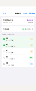
🟢 對齊喬喬看併桌(選桌)
reservation-squeeze-select
Swift:兩階段 sheet:①選桌(客戶摘要+已選容量+可多選桌列含容量徽章)→②分配人數(stepper per 桌+通知預覽),導覽列含取消/上一步與下一步/確認安排。
缺口 0 項
- (無差異)
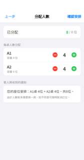
🟢 對齊喬喬看併桌(分配人數)
reservation-squeeze-allocate
Swift:兩階段喬喬看併桌 sheet 的第二階段:導覽列含「上一步」/「分配人數」標題/「確認安排」按鈕,Section 1 顯示已分配人數進度(不足時顯示剩餘/超出提示),Section 2「每桌人數分配」每桌含桌名、容量、Stepper(minus.circle.fill / 人數 / plus.circle.fill),Section 3「客人將收到的通知」顯示分配摘要與說明文字。
缺口 0 項
- (無差異)
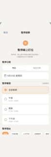
🟢 對齊暫停接單
reservation-pause-booking
Swift:暫停接單 Sheet:Header(pause.circle.fill 圖示48pt橘色+暫停線上訂位標題+說明)、暫停日期(今日/指定日期分段控制+目標日期卡含已暫停膠囊)、暫停餐期(全部餐期+個別餐期多選含時間副標,橘色選中狀態)、暫停理由(6個快選chip橫向滾動+自訂輸入框)、info提示區塊(primary淡底)、確認暫停/更新暫停設定橘色全寬按鈕。
缺口 0 項
- (無差異)

🟢 對齊售完暫停 banner
reservation-sellout-banner
Swift:橘底橫幅(orange.opacity(0.12) + 底部 2pt 橘線):exclamationmark.octagon.fill 圖示(orange, 22pt) + VStack(標題 headline/semibold、原因 caption1/textSub、提示 caption2/textSub) + Spacer + 「我已備新料」鈕(StitchColors.primary 背景, white, H-pad14/V-pad8, cornerRadius.s, 無 itemId 時 disabled)。HStack alignment:.top, spacing:12,Conta
缺口 0 項
- (無差異)
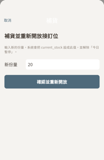
🟢 對齊售完暫停・補貨
reservation-sellout-restock
Swift:補貨 sheet:NavigationStack 內嵌標題「補貨」+取消鈕、大標「補貨並重新開放接訂位」、說明文字、新份量輸入列(預設 20,數字鍵盤)、條件式錯誤訊息、全寬 StitchColors.primary 主色按鈕「確認並重新開放/處理中…」。
缺口 0 項
- (無差異)

🟢 對齊婉拒訂位
reservation-decline
Swift:NavigationStack sheet (.medium/.large detents). Title: 婉拒·姓名(原因)font(.headline=17pt w600). Three sections: (1) AI婉拒 option row (sparkles icon, primary color, subtitle); (2) 手動回覆 card (TextField + 送出並封存 accentOrange capsule button); (3) 靜默封存 option row (archivebox icon, textSub color, long subtitle).
缺口 0 項
- (無差異)

🟢 對齊LINE 智慧客服設定
reservation-line-settings
Swift:5 sections (SwiftUI Form): (1) 回覆模板(按鈕送給客人的訊息)— NavigationLink 'text.bubble' icon + caption2 note; (2) 接你自己的 AI — orange warning block (aiAutoReplyEnabled flag OFF), Picker row, model TextField, SecureField API key, caption, websiteUrl TextField, save button (square.and.arrow.down blue); (3) AI 記憶庫(
缺口 0 項
- (無差異)

🟢 對齊LINE 回覆模板編輯
reservation-line-templates
Swift:iOS grouped Form,頂部可用變數說明區塊 + 8 情境各一 Section(TextEditor minHeight 88、已自訂綠色/系統預設灰色狀態列、還原預設按鈕、footer hint)+ 右上儲存按鈕(saving 狀態改「儲存中…」disabled)+ 底部 Toast capsule overlay。
缺口 0 項
- (無差異)

🟢 對齊訂位時序進度
reservation-progress-timeline
Swift:可重用的訂位生命週期時序進度元件,包含標題列、每個階段節點圓圈(完成綠/進行中藍/未來灰15%)、連接線、階段名稱、時間戳或「進行中」藍字,以及可選的斜體備註。
缺口 0 項
- (無差異)
⑨ 報表 🟢6 🟡0 🔴0

🟢 對齊戰情室(KPI + 警示 + 時段 + 排行 + 小費 + 模組)
reports-dashboard
Swift:戰情室共 7 區塊:期間分段切換(今日/本週/本月)、4 KPI 卡(營業額/來客數/客單價/翻桌率 含趨勢)、動態警示卡、時段營收 heatmap(9-22 時)、熱銷/待觀察雙排行卡(各前 5)、員工小費次數排行(只顯次數不顯金額)、深入分析 5 模組按鈕(營收趨勢/菜品表現/營運日誌/資料匯出/資料健康檢查)。
缺口 0 項
- (無差異)
🟢 對齊營收趨勢(日別/時段/付款)
reports-revenue-trend
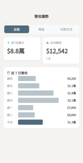
Swift:三分頁(日別/時段/付款方式):日別頁含「近7日累計」和「日均營收」兩個 MetricCard 與水平比例條圖、時段頁含 heatmap 熱圖加四色圖例及午晚尖峰卡、付款方式頁含各管道金額與百分比列表,三頁均有空狀態文字。
缺口 0 項
- (無差異)
🟢 對齊菜品表現(排行 / 類別佔比)
reports-menu-performance
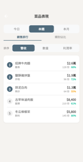
Swift:期間分段選擇(今日/本週/本月)+底線分頁(銷售排行/類別佔比);排行tab含「排序」標籤+三選一分段(營收/數量/利潤率)+卡片列表(圓圈排名前三填色、品名、類別、營收、份數、利潤率%綠/橙色彩);類別tab含 chart.pie section header、類別名/百分比/金額右對齊+7色橫向進度條;空狀態「尚無資料」。
缺口 0 項
- (無差異)
🟢 對齊營運日誌(訂單 / 作廢 / 付款)
reports-operation-log
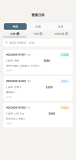
Swift:三分頁(訂單/作廢/付款記錄)+期間選擇器(今日/本週/本月)+搜尋列;訂單卡含編號/桌號/狀態badge/品項數/付款方式/品名預覽/時間;作廢卡含紅色輪廓圓X圖示與負金額;付款卡含圓形圖示方塊(綠/紅)+付款方式+末四碼+金額;空狀態圖示+「尚無資料」。
缺口 0 項
- (無差異)

🟢 對齊資料匯出(CSV / Excel)
reports-data-export
Swift:4 sections: (1) 日期範圍 card — 4-option segmented picker (今日/本週/本月/自訂), optional custom date fields, date range text; (2) 資料類型 card — header + 全選/取消全選, 6 type rows (checkbox + icon + name/description), dividers, disabled state for types without local data source; (3) 匯出格式 card — radio button tiles (CSV
缺口 0 項
- (無差異)
🟢 對齊資料健康檢查
reports-data-health
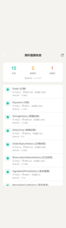
Swift:資料健康檢查畫面:摘要 pill(正常/無資料/未實作計數 + 最後檢查時間)+ 15 筆 Model 列表(狀態圖示、今日/本月/總計、最後記錄、未實作紅字)+ 狀態說明圖例,AppBar 有重新整理按鈕。
缺口 0 項
- (無差異)
⑩ 設定 🟢49 🟡9 🔴0

🟡 小差設定主畫面(搜尋 + 常用 + 分類磁磚 + 卡片)
settings-hub
Swift:POSSettingsView v5 hub(由上而下):搜尋框(magnifyingglass + 清除鈕)→ 常用捷徑橫向列(標籤「常用 · 前三固定,其餘可自訂」+ 3 固定磁磚 + 虛線自訂加磁磚)→ 訂閱管理列(creditcard.fill 實心綠 + 「訂閱管理」/「查看及管理方案」)→ POSQuickSetupBanner(橘色 warning 圖示 + 進度條 + N/M)→ 8 分類磁磚 2 欄 grid(各有漸層底 + 42×42 圖示 + 標題 + N項設定)→ 底部(版本文字置中 + 重新同步資料按鈕含 arrow.triangle.2.circlepath + 登
缺口 3 項
- 訂閱管理列圖示:Swift 用 creditcard.fill(實心),Flutter _SubscriptionRow 用 Icons.credit_card(輪廓);語義與版面完全一致,僅 fill/outline 狀態差異。
- 分類卡片目的地頁(NavigationLink push 後)的「點餐與菜單」卡片:Swift 有 orderingSettingsInline(訂單合併時間 Stepper + 線上預先點餐 Toggle + 允許客人修改訂單 Toggle)三組 inline 互動控件;Flutter gallery fakes 以平坦 SettingsRowVM 靜態列取代,無 Stepper/Picker widget。主 hub 截圖不可見此層,code 層有落差。
- 「營業結算」卡片 checkoutSettingsInline:Swift 有結帳地點(Segmented Picker 桌邊/臨櫃)+ 結帳時機(Segmented Picker 餐後/點完餐)兩組互動控件;Flutter fakes 只有「結帳地點」單一靜態 SettingsRowVM 列。同屬分類頁內容,主 hub 截圖不可見。

🟡 小差發票設定
settings-invoice
Swift:發票設定頁共 7 個 Section:(1) 發票服務商(TapPay/ezPay segmented + 啟用 Toggle + footer);(2) 賣方資訊(統一編號 + 公司抬頭 + footer);(3) 稅率(營業稅率 row + Slider + footer);(4) 發票預設行為(預設方式 3-option segmented + 發票內容 2-option segmented + 條件餐費標籤 + footer);(5) 服務商專屬欄位(TapPay:Partner Key SecureField+Merchant ID;ezPay:商戶代號+Hash Key Secur
缺口 1 項
- ezPay 設定區的「環境」在 Swift 是未加 .pickerStyle(.segmented) 的 Picker,在 Form 裡呈現為 navigation-link 樣式(左側 label「環境」,右側顯示當前選項,點擊跳子頁);Flutter 以 _rowPad(_segmented()) 呈現為自訂 segmented control(無左側 label,選項直接橫排)。版面呈現不同,但資料語義相同。

🟡 小差付款方式設定
settings-payment
Swift:PaymentSettingsView.swift:TapPay / Tap to Pay 整區以 `if false` 隱藏,實際畫面只顯示三個 Section:(1) 藍新金流 NewebPay — 啟用 toggle + 環境 Picker(sandbox/production) + 商戶代號/HashKey/HashIV TextField(SecureField+eye toggle) + 測試連線按鈕(checkmark.seal.fill/antenna icon) + 未測警告文字 + footer;(2) 啟用的付款方式 — 9 個 Toggle(信用卡永遠開+disable
缺口 1 項
- 信用卡 toggle(locked=true, value=true)在 Flutter 的 disabled+selected 狀態使用 primary.withValues(alpha:0.5) 作為 track 色,截圖上顯示偏灰、看起來像未開啟,而 Swift disabled Toggle 的視覺慣例是保留完整藍色 track 僅降低互動性;建議改用更高 opacity(0.6-0.7)或 primary 本色,讓「永遠開啟」的信用卡更清晰。

🟢 對齊小費設定
settings-tip
Swift:TipSystemSettingsSheet: NavigationStack + Form. Section 1 (always visible): Toggle '啟用員工小費系統' + footer. When enabled: Section 2 '小費去向' with inline Picker (directToStaff / restaurantCollectThenDistribute) + caption; Section 3 '預設打賞金額' with dollarsign.circle icon + formatted amounts + 編輯 button + foot
缺口 0 項
- (無差異)
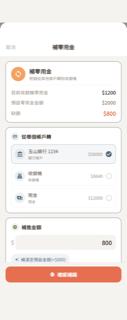
🟢 對齊補零用金
settings-pettycash
Swift:補零用金 sheet:狀態 card(目前/預設/缺額三列)+來源帳戶選擇(多列帶餘額與選取圓圈)+補進金額輸入+補滿快選膠囊+餘額不足警告+記帳預覽 footer+確認補錢底部按鈕。
缺口 0 項
- (無差異)

🟢 對齊員工管理
settings-staff-management
Swift:NavBar: 邀請(person.badge.plus) left + qrcode.viewfinder + ellipsis.circle menu(權限模板/薪資階級) + 完成 right。Searchable bar。水平篩選膠囊(全部+各角色含人數,viewer排除)。兩張員工卡:等待回應(hourglass+count)+在職員工(count)。每列:40px circle頭像(initials/角色色)+名字+角色徽章(icon+text白字on角色色capsule)+pending badge if pending+email+chevron。下方邀請卡:Email邀請(p
缺口 0 項
- (無差異)

🟢 對齊員工詳情
settings-staff-detail
Swift:員工詳情 sheet:導覽列 inline 標題(員工名)+ 完成鈕;頭像卡(84pt 圓形 initials + 名字 + email + 角色膠囊徽章);動作卡(角色/權限模板/自訂權限/HR 資料,各帶漸層方形 icon + chevron,divider leading 58);danger 卡(移除此員工,error 紅色 icon + 文字,可選錯誤訊息)。
缺口 0 項
- (無差異)

🟢 對齊邀請員工
settings-invite-staff
Swift:邀請員工 sheet:introCard(漸層圖示+說明)、emailCard(Email 輸入+找使用者按鈕)、foundCard/notFoundCard(條件顯示)、roleCard(員工/主管/管理員單選含 hint+頁腳)、error/success 卡;導覽列含取消+送出邀請。
缺口 0 項
- (無差異)
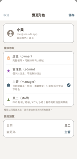
🟢 對齊變更角色
settings-role-picker
Swift:NavigationStack inline-title '變更角色',取消/儲存 toolbar buttons(儲存 semibold,未改動或有 validationError 時 disabled)。loading 中顯示 ProgressView。insetGrouped List 三個 Section:(1) staffInfoSection — person.crop.circle.fill (40pt secondary) + name(headline) + email(caption) + 目前角色(caption);(2) levelPickerSection — hea
缺口 0 項
- (無差異)

🟢 對齊自訂權限
settings-permission-overrides
Swift:員工 per-module 權限 override 畫面:NavBar(關閉+標題)、Header 卡(圓形頭像+角色色徽章+姓名+副標)、各模組權限卡(15 個模組、各含 label/note/bitmask 狀態標籤/「變更」下拉鈕)、Help 說明卡,可選紅色錯誤卡。
缺口 0 項
- (無差異)
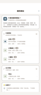
🟢 對齊權限模板
settings-permission-templates
Swift:共四張卡片:說明卡(什麼是權限模板)、內建模板清單卡(不可編輯列、含「內建」徽章)、自訂模板清單卡(可編輯、空狀態文案)、使用說明卡(4步驟);導覽列標題「權限模板」+右上角「+」新增按鈕。
缺口 0 項
- (無差異)
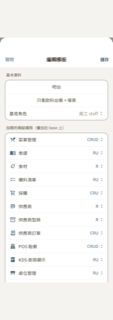
🟡 小差編輯權限模板
settings-permission-template-edit
Swift:POSPermissionTemplateEditSheet: NavigationStack + Form,三模式(create/edit/view 唯讀)。Toolbar: 關閉(cancellationAction)+ 儲存(confirmationAction, semibold, 名稱空白時 disabled)。Section 基本資料: TextField 名稱、TextField 說明(multiline vertical)、Picker 基底角色(owner/admin/manager/staff)。Section 加開的模組權限(疊加在 base 上): 21 個 Featu
缺口 1 項
- 基本資料區塊的名稱/說明欄位在 Flutter 中以裸 Text widget 模擬 TextField,無 textAlign 設定,在卡片容器內視覺上呈現置中效果;Swift 的 TextField 為標準左對齊。屬靜態呈現小差,不影響功能結構。
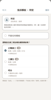
🟢 對齊指派模板
settings-template-assign
Swift:指派模板 sheet:含 isTopTier 皇冠卡片分支、headerCard(頭像+姓名+角色)、noneCard(不套任何模板單選)、模板清單(單選+內建膠囊+模組數)、footer 加成說明、errorCard;儲存按鈕在未變更時 disabled。
缺口 0 項
- (無差異)
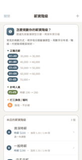
🟢 對齊薪資級距
settings-pay-grades
Swift:薪資階級管理頁:NavigationStack(關閉/+工具列)+ ScrollView,含引導說明卡(dollar 圖示漸層底色 + 三類範例 block)、本店階級列表卡(代號 Capsule+名稱+薪資摘要主色+加班倍率+備註+chevron,swipe 刪除)、下一步說明卡,空狀態有提示文字。
缺口 0 項
- (無差異)
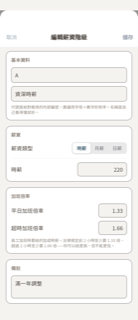
🟢 對齊編輯薪資級距
settings-pay-grade-edit
Swift:Sheet with NavigationStack (inline title '新增/編輯薪資階級', 取消 leading, 儲存 trailing semibold). Form with 4 sections: (1) 基本資料 — 代號 TextField + 名稱 TextField + footer; (2) 薪資 — segmented Picker (時薪/月薪/日薪) + base amount trailing field; (3) 加班倍率 — 平日加班倍率 + 超時加班倍率 with trailing decimal inputs + legal footer; (
缺口 0 項
- (無差異)
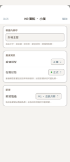
🟢 對齊員工 HR 資料
settings-staff-hr
Swift:員工 HR 資料編輯 sheet,含三張卡:餐廳內稱呼(自由文字輸入)、雇傭資訊(雇傭類型 Picker + 在職狀態 Picker 含色點)、薪資(薪資階級 Picker,無階級時顯示空狀態提示);導覽列有取消/儲存按鈕,讀取中顯示 ProgressView,儲存失敗顯示錯誤卡。
缺口 0 項
- (無差異)

🟢 對齊會員集點管理
settings-loyalty
Swift:4-tab sheet: (0) QR Code — 加入會員集點 heading, subtitle, 220x220 QR image (white bg + shadow + cornerRadius), URL caption, 分享連結 button (square.and.arrow.up), stat cards (總會員 blue person.2.fill / 點數比 orange star.fill); (1) Members — search bar, list rows with name + VIP crown.fill yellow capsule-icon-onl
缺口 0 項
- (無差異)
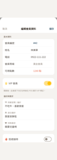
🟢 對齊會員資料編輯
settings-member-edit
Swift:NavigationStack sheet:取消/儲存 toolbar。五個區塊:① 基本資料 card(會員編號 primary monospaced、姓名 inputRow、電話 inputRow phonePad、會員等級 textSub、可用點數 accentOrange);② VIP toggle card(crown.fill yellow tint)+ footer;③ 偏好與需求(三個 multilineField:fork.knife 用餐習慣/chair.fill 座位偏好/heart.circle 特殊需求);④ 拒絕接待 toggle(hand.raised.fill
缺口 0 項
- (無差異)
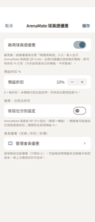
🟢 對齊球員證優惠設定
settings-player-card
Swift:Form 含四大 Section:啟用 toggle(含 footer)、預設折扣 % stepper(isEnabled 時顯示)、進階分段位 toggle + 七段位彩色色點 stepper(isEnabled 時顯示)、管理會員優惠 NavigationLink(ticket icon),NavBar 有取消/儲存。
缺口 0 項
- (無差異)
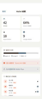
🟢 對齊錢包儀表板
settings-wallet-dashboard
Swift:Wallet Pass 總覽:2×2 統計卡片(總會員/滲透率/Apple Wallet/Google Wallet)、會員卡分佈橫條圖 + legend、建立優惠券與批次更新兩顆動作按鈕、最近加入的會員列(頭像圓圈+姓名+積點+等級標籤+wallet 圖示)。
缺口 0 項
- (無差異)
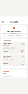
🟢 對齊錢包優惠券管理
settings-wallet-offer
Swift:4 sections: (1) Header — ticket.fill icon (40pt orange), title '自動派券到會員的 Wallet', subtitle text. (2) Existing Coupons — Label with list icon; loading/empty/list states; each coupon card has title, code badge, active status pill (green/secondary), discount row (percent or amount label + icon in orang
缺口 0 項
- (無差異)
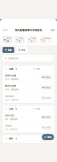
🟢 對齊預先點餐菜單可見度
settings-all-menu-items
Swift:Swift 版包含:統計列(總品項/可預訂/已隱藏/套餐受影響)、單點/套餐類型選擇器、搜尋欄、可收合分類卡片(含品項數badge+隱藏數提示)、品項列(名稱刪除線/dimmed+套餐badge+價格+毛利+套餐內容物標籤+可見度切換/受影響標記)、浮動選取膠囊按鈕、底部多選工具列(全選/設為可見/設為隱藏/已選數/完成)。
缺口 0 項
- (無差異)
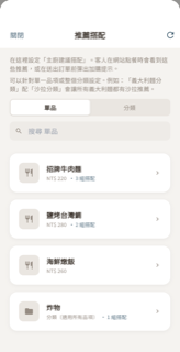
🟢 對齊推薦搭配
settings-menu-pairings
Swift:推薦搭配主畫面:頂部雙段說明文字、單品/分類 segmented tab、搜尋欄、source 卡片列(44×44 icon + 名稱 + 價格或分類副標 + N 組搭配 primary 色 + chevron),toolbar 有關閉與刷新按鈕。
缺口 0 項
- (無差異)
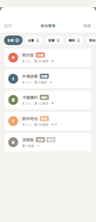
🟢 對齊區站管理
settings-zone-management
Swift:NavBar:關閉/區站管理(uppercase+tracking)/完成。水平捲動篩選膠囊(全部/出餐/送餐/備料/吧台/其他,各帶 count badge,選中 primary 底白字,未選 surface+border)。區站卡片列表:40px 色圓+角色 icon(白)、名稱+角色 badge(區站色 0.8)+停用 badge(灰,條件)、員工數(person.fill,條件顯示)+道菜數(menucard)+可見度指示(flame orange / figure.walk info / eye.slash)、chevron.right。空狀態(尚無區站/無此類型)。ZoneEdit
缺口 0 項
- (無差異)
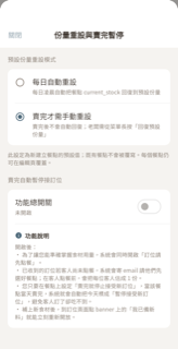
🟢 對齊份量重設與賣完暫停
settings-stock-management
Swift:NavigationSheet 含兩個區塊:①預設份量重設模式(每日自動 / 賣完手動 兩個 radio 列 + footer 說明)②賣完自動暫停接訂位(功能總開關 Toggle + 已/未開啟副標 + 功能說明 info box 4 bullet),底部條件顯示錯誤訊息(紅)與已寄通知筆數(綠)。
缺口 0 項
- (無差異)
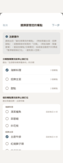
🟡 小差售完暫停目標餐點
settings-sellout-target
Swift:兩步驟 sheet:Step 1 選擇目標(分類整類 + 個別餐點,各有 checkmark.circle.fill/circle icon、item count、已設份量標籤);Step 2 設定份量(分類卡片含 segmented uniform/perItem、整類 stepper、個別 stepper;standalone 餐點清單)。NavBar:取消(cancellationAction)+ 下一步/確認並開啟(confirmationAction)。Intro box 含 info.circle.fill + 說明文字。分類卡片標題用 folder.fill(orange)。
缺口 2 項
- 分類卡片標題圖示:Swift 用 folder.fill(實心),Flutter 用 Icons.folder(輪廓)。語義相同,僅填色版本差異。
- Intro 圖示:Swift 用 info.circle.fill(圓形實心),Flutter 用 Icons.info(無圓框輪廓)。語義相同,視覺略有差異。

🟢 對齊訂位設定
settings-reservation
Swift:訂位設定 sheet,含四區塊:用餐時間(預設時長 picker)、預約限制(最少/最多提前 TextField)、取消與退款規則(最少提前取消 + 退款段數設定按鈕+chevron+摘要)、線上預先點餐(開放模式 picker + 條件式付款方式 picker);toolbar 有取消/儲存。
缺口 0 項
- (無差異)
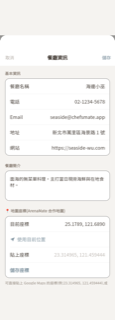
🟢 對齊餐廳資料
settings-basic-info
Swift:Swift SharedBasicInfoEditSheet 包含:NavigationBar(取消/餐廳資訊/儲存)、基本資訊 Section(餐廳名稱/電話/Email/地址/網站 LabeledContent 右對齊)、餐廳簡介 Section(TextEditor minHeight 100)、條件顯示的地圖座標 Section(目前座標、使用目前位置 location.fill 圖示、貼上座標、儲存座標按鈕、錯誤/成功訊息、footer 說明文字)。
缺口 0 項
- (無差異)
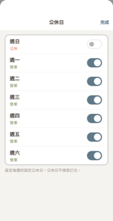
🟢 對齊公休日
settings-business-hours
Swift:公休日設定頁:NavigationStack 含 inline 標題「公休日」與右上「完成」按鈕,List 呈現週日到週六共 7 列(每列日名、營業/公休狀態文字、Toggle),Section footer 說明「公休日不接受訂位」。
缺口 0 項
- (無差異)

🟢 對齊訂金設定
settings-deposit
Swift:SharedDepositSettingsSheet 包含:(1) 需要訂金 Toggle + footer;(2) 訂金門檻 Section(Stepper 2-20人,顯示「訂位人數達 N 人以上」);(3) 訂金金額 Section(全寬 Segmented 固定/按人頭 + 金額行 + 按人頭預覽行 + footer);(4) 收款帳戶 Section(Picker 選銀行帳戶 + 銀行/末四碼詳情行 + footer,或空狀態警告);(5) 匯款後確認方式 Section(管道 Picker + 聯絡方式 TextField + footer);(6) 訂金說明 Section(Te
缺口 0 項
- (無差異)
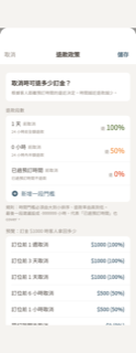
🟢 對齊退款政策分級
settings-refund-policy-tiers
Swift:多段退款政策設定 Sheet:說明標題區、退款段數(N 段門檻+退款率+標籤+新增/滑刪+驗證錯誤)、訂金 $1000 預覽 6 情境、恢復預設值(3 段制)按鈕,導覽列含取消/儲存。
缺口 0 項
- (無差異)
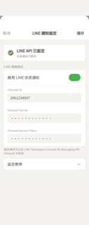
🟢 對齊訂位確認 LINE 設定
settings-booking-line
Swift:Swift SharedLINESettingsSheet 含三區塊:狀態卡(圖示+標題+說明文字)、LINE 連線設定(啟用開關+Channel ID/Secret/Token 欄位+footer 說明)、設定教學(DisclosureGroup,6 步驟圓形數字徽章);導覽列標題「LINE 通知設定」+取消/儲存按鈕,儲存在無變動時 disabled。
缺口 0 項
- (無差異)
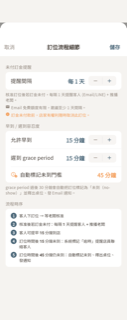
🟢 對齊訂位流程細節
settings-reservation-flow
Swift:三個 Form Section:未付訂金提醒(Stepper 間隔天數 + footer 含 envelope.fill / info.circle.fill 圖示)、早到/遲到容忍度(兩個 Stepper + clock.badge.exclamationmark.fill 門檻列)、流程時序(1~5 步 1.circle.fill…5.circle.fill 填色圓 + bold 動態數值);AppBar 有「取消」/「儲存」。
缺口 0 項
- (無差異)
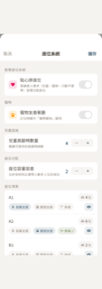
🟢 對齊座位系統
settings-seating
Swift:五個 section:智慧座位系統(貼心排座位 toggle)、寵物(寵物友善餐廳 toggle)、兒童設施(高腳椅數量 stepper)、座位分配(容量容差 stepper)、座位清單(每桌含名稱+容量+長輩/寵物 chip+併桌按鈕+眼睛開關,附 footer 說明與空狀態文字);導覽列含取消與儲存按鈕。
缺口 0 項
- (無差異)
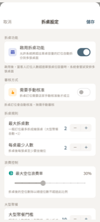
🟢 對齊拆桌設定
settings-split-table
Swift:拆桌設定 Sheet:五個 section(拆桌功能 toggle + 審核方式 toggle + 拆桌規則兩步進器 + 浪費控制 teal 滑桿 + 大型聚餐門檻步進器),啟用才顯示後四 section,Navbar 含取消/儲存。
缺口 0 項
- (無差異)
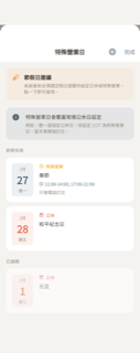
🟢 對齊特殊營業日
settings-special-dates
Swift:特殊營業日主清單畫面:節假日建議區塊(頂部)→ 說明區塊 → 即將到來清單 → 已過期清單(0.6 透明)→ 空狀態;右上 + 新增與完成按鈕;卡片含日期格(月/日/週)+ 類型標籤(公休紅/特殊營業橙)+ 標題 + 時段(specialHours)+ 備註。
缺口 0 項
- (無差異)
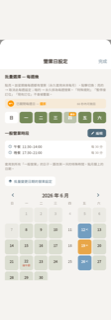
🟢 對齊營業日設定(供餐時段)
settings-reservation-slots
Swift:SharedReservationSlotsSheet 由六區塊組成:(1) 批量選擇每週幾 weekday chip(lit/partial/dark 三態 + 部分小 badge + W4 undo 橫幅 60 秒可救回);(2) 一般營業時段摘要(clock icon + 名稱時段間隔 + 編輯按鈕);(3) 批量變更日期的營業設定按鈕(square.stack.3d.up);(4) 月曆(上下月導覽 + 星期表頭 + 7 欄 grid,每格底色:normalOpen 綠 0.20 / specialOpen 藍 0.85 / paused 橙 0.85 / closed 透明,特殊/暫
缺口 0 項
- (無差異)

🟢 對齊一般供餐時段
settings-regular-periods
Swift:NavigationStack sheet, inline title 「一般營業時段」, leading 取消 / trailing 儲存(semibold)。Body: (1) headerInfo 兩行 caption textSub 說明文字;(2) periodsSection:「供餐時段」小標 + 每張卡片含名稱欄(底線 TextField 樣式)+ 開始時間/結束時間/客人最晚可待到三行 DatePicker pill + 右上角紅色 minus.circle 刪除鈕 + 下方「新增時段」按鈕(plus.circle.fill icon);(3) intervalSection:
缺口 0 項
- (無差異)
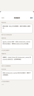
🟢 對齊訊息設定
settings-message
Swift:NavigationStack Form 含四個 TextEditor 區塊(歡迎/確認/提醒/取消訊息,各有 header + footer)+ 說明區塊(可用模板變數五列,等寬字體 primary 色左 + textSub 說明右),工具列取消(textSub)/儲存(semibold primary)。
缺口 0 項
- (無差異)
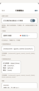
🟢 對齊行事曆整合
settings-calendar
Swift:SharedCalendarSettingsSheet 含:NavBar(取消灰色/儲存主色粗體)、自動化設定 Toggle + footer、行事曆選擇(Picker 帶色點或授權按鈕兩態)+ footer、標題格式 TextField + 變數 footer、描述格式 TextEditor(minHeight 100)+ 變數 footer、預覽區(標題+Divider+描述,套入假資料)。
缺口 0 項
- (無差異)
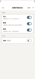
🟢 對齊服務鈴設定
settings-service-bell
Swift:SharedServiceBellSheet: NavBar (完成 left textSub / 服務鈴預設訊息 centre inline / 編輯 + + right both primary), grouped List with '已啟用' and '已停用' sections. Each row: label (headline) + optional '已停用' badge (gray bg caption2) + optional '自動回覆:…' caption + right-side Toggle (tint=primary). Empty-state: ContentU
缺口 0 項
- (無差異)
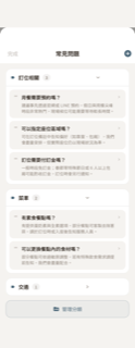
🟢 對齊常見問題
settings-faq
Swift:SharedFAQManagementSheet:NavigationStack inline title「常見問題」,左「完成」右 plus.circle.fill。ScrollView LazyVStack(spacing:14)。有資料時:依分類分組可收合卡片(header: tag.fill + 分類名 + 數量 capsule badge + chevron.down 旋轉),展開後逐筆問答卡(line.3.horizontal 拖拉把手 + 問題 bold + 答案 2行 + chevron.right),底部「管理分類」按鈕(folder.badge.gearshape icon
缺口 0 項
- (無差異)
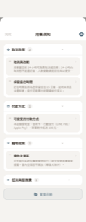
🟡 小差用餐規範
settings-dining-policies
Swift:SharedDiningPoliciesSheet:ScrollView + LazyVStack,依分類分組可收合卡片(header = 分類 icon 12pt bold + 名稱 semibold 15 + 數量 capsule badge + chevron 旋轉),分類內逐筆規範卡(line.3.horizontal 拖拉把手 + 標題 semibold 14 + 內容 2行 12pt + chevron),底部「管理分類」outline button(folder.badge.gearshape icon),空狀態(doc.text 48pt),navbar 左「完成」右「plus
缺口 3 項
- 兒童政策分類 icon:Swift 用 figure.2.and.child.holdinghands(兩大人牽小孩),Flutter 用 Icons.family_restroom(家庭廁所標誌)。語義近但視覺不同。
- 服裝要求分類 icon:Swift 用 tshirt(T恤輪廓),Flutter 用 Icons.checkroom(衣帽間掛鉤)。語義近(衣著相關)但視覺略異。
- 管理分類按鈕 icon:Swift 用 folder.badge.gearshape(資料夾+齒輪徽章),Flutter 用 Icons.rule_folder(folder with rule lines)。語義均為「管理分類資料夾」,截圖顯示 icon 差異細微。

🟡 小差會員集點方案設定
settings-loyalty-program
Swift:8 sections when isEnabled=true: (1) 集點方案 — Toggle + 方案名稱 + 集點比率 (每消費 NT$X = 1點) + 點數有效期限 + dynamic footer; (2) 會員等級 — tier rows (color dot / name / 門檻 / 集點倍率 / expand chevron) + expandable 等級獎勵 editor (5 benefit types each with icon+toggle+sub-config) + header-trailing '生日驚喜模板' wand button + '新增等級'
缺口 2 項
- '新增等級' / '新增獎勵' action rows use Icons.add_circle_outline (outline) while Swift uses plus.circle (filled). Semantics identical; fill style differs slightly.
- 餐廳位置 mini-map:Swift renders a real MapKit LoyaltyMapSnippet with map tiles (height 150); Flutter uses a tinted background container + Icons.location_on placeholder — acceptable for a static gallery render but lacks real map texture.
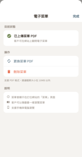
🟢 對齊電子菜單上傳
settings-menu-pdf
Swift:電子菜單 PDF 上傳管理 Sheet,含「目前狀態」(已上傳/尚未上傳兩種態)、「操作」(上傳/更換/刪除+10MB footer)、條件性錯誤訊息區塊、「說明」三條 Label,NavigationBar 標題「電子菜單」+右側「完成」按鈕。
缺口 0 項
- (無差異)

🟢 對齊品牌文案
settings-brand-content
Swift:品牌文案設定頁:導覽列「關閉」/「儲存」、兩行 intro 說明、三個文案區塊(Slogan/簡短介紹/歡迎訊息)各有彩色圓圈圖示+標題+副標+多行 TextField,底部可顯示儲存成功綠色 banner。
缺口 0 項
- (無差異)
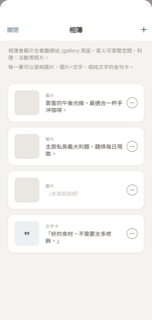
🟢 對齊相簿
settings-web-gallery
Swift:POSGallerySheet:相簿管理清單,導覽列「關閉」+「+」、兩行 header 說明、圖片卡與文字金句卡列表(64×64 縮圖、型別標籤大寫、說明文字或斜體佔位、ellipsis.circle 選單含編輯說明/上移/下移/刪除)、空狀態(photo.on.rectangle.angled + 兩行文案)。
缺口 0 項
- (無差異)

🟢 對齊個人資料
settings-my-profile
Swift:顯示頭像、名字、Email、角色 badge(owner/manager/staff 等色彩),含「基本資料」可編輯區段(顯示名稱/Email/儲存變更)、所屬餐廳清單(當前/切換 badge)、登入方式,共四大區塊。
缺口 0 項
- (無差異)
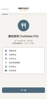
🟢 對齊首次啟動精靈
settings-first-run-wizard
Swift:7 頁 TabView wizard:頂部 7 段進度條(h=4、primary/textSub@20%)+ toolbar 中央「N/6 已完成」(warning/success)+「稍後設定」左鈕(isAllComplete 時成 success 色)+「完成」右鈕(全完成才顯示);歡迎頁 fork.knife.circle.fill 大圖示(80pt、primary)+標題+6 項清單卡(surface 背景、各 item icon+title+checkmark.circle.fill 已完成);Pages 1-5 用 PageContainer(48pt icon+title3+su
缺口 0 項
- (無差異)
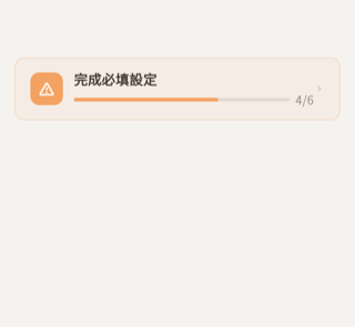
🟢 對齊快速設定提示橫幅
settings-quick-setup-banner
Swift:設定頁頂端橫幅:未完成顯示橘色警示三角+「完成必填設定」+進度條(h=4)+N/6 計數+chevron.right;已完成切換為綠色 checkmark.circle.fill +「已完成所有必填設定」,下方加 Divider(leading 52)+ arrow.counterclockwise.circle.fill 圖示+「重新檢視教學」文字按鈕。卡片背景 accent.opacity(0.08)、邊框 accent.opacity(0.3)、cornerRadius StitchRadius.m。
缺口 0 項
- (無差異)

🟢 對齊教學覆蓋層
settings-tutorial-overlay
Swift:Full-screen ZStack overlay: black 0.5 opacity scrim (ignoresSafeArea) + bottom-anchored card (horizontal padding 24, bottom 32). Card (padding 20, VStack spacing 16): header row with 36x36 icon container (primary color, 0.12 bg, radius 8) + VStack (caption 教學提示 N/M textSub + subheadline bold title t
缺口 0 項
- (無差異)

🟢 對齊操作記錄
settings-audit-log
Swift:「操作記錄」查詢畫面:NavigationBar(操作記錄 + 完成按鈕)、9 個水平 filter chips(全部/訂位/訂單/付款/訂金/員工/出餐/權限/模板)、每筆記錄列(36×36 彩色 icon badge + 友善事件名 + 相對時間 + 可空摘要行)、empty state、permission denied state、下拉重新整理。
缺口 0 項
- (無差異)
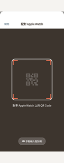
🟢 對齊配對 Apple Watch
settings-watch-pairing
Swift:四個互斥全螢幕狀態:QR 掃描器(相機預覽鋪滿+250×250 白框+橘色 L 角+提示文字+底部手動輸入膠囊)、手動輸入(keyboard 圖示+6位等寬 TextField+開始配對橘按鈕+返回掃描次要按鈕)、相機權限被拒(camera.fill+前往設定+手動輸入)、配對結果(成功綠勾/失敗紅三角+重新掃描/完成/關閉按鈕)。導航列「配對 Apple Watch」+「關閉」左鈕。
缺口 0 項
- (無差異)
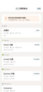
🟢 對齊工程師後台
settings-engineer-dashboard
Swift:導覽列標題「🛠 工程師後台」+ 右側「完成」按鈕,頂部橙色警告橫幅(影響所有餐廳 + audit_logs 提醒),依 tier 分組列出5個訂閱方案(免費/Starter/Growth/Business/Enterprise),每列含方案名稱、NT$價格、員工/分店/月訂位上限、plan_code,以及 email 白名單拒絕存取畫面。
缺口 0 項
- (無差異)

🟢 對齊工程師工具箱
settings-engineer-toolbox
Swift:工程師工具箱含警告橫幅、功能開關、訂閱系統(切換器+後台)、目前登入、帳號切換(本地模式狀態+登出+條件性退出本地模式)五大 Section,以及 access denied 畫面;email 白名單 gate,insetGrouped List 版型,Navigation title「🛠 工程師工具箱」+「完成」按鈕。
缺口 0 項
- (無差異)
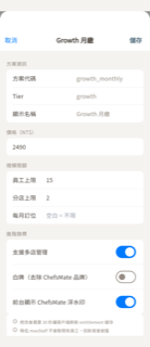
🟡 小差編輯訂閱方案
settings-engineer-plan-edit
Swift:NavigationStack + Form. Toolbar: 取消 (cancel) leading, 儲存 (semibold) trailing. Confirm alert on save. Sections: (1) 方案資訊 — 3 read-only LabeledContent rows (方案代碼, Tier, 顯示名稱). (2) 價格(NT$)— single TextField. (3) 規模限額 — 3 HStack rows with 80pt-wide left label (員工上限/分店上限/每月訂位) + TextField. (4) 進階旗標 — 3 T
缺口 1 項
- Warning footer section: Flutter renders it via _section(header:null) which still wraps content in a surfaceLight rounded-card Container, giving it the same card appearance as other sections. Swift Section { warningFooter } without a header renders as a borderless, background-less grouped-list footer. The screenshot confirms the footer text appears inside a card in Flutter rather than as bare footer text.
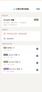
🟡 小差訂閱方案切換器
settings-subscription-tester
Swift:NavigationStack (inline title '🧪 訂閱方案切換器' + '完成' trailing button). Three List sections: (1) '目前訂閱' — currentRow: displayName headline + statusBadge (green/red pill), HStack with person.2/building.2/dollarsign.circle-or-gift labels, '有效至:' caption2 date. (2) '快速動作' (conditional on currentSub != nil)
缺口 1 項
- Trailing arrow icon in plan rows: Swift uses 'arrow.right.circle' (outlined circle with arrow), Flutter uses Icons.arrow_circle_right which renders as a filled dark-blue solid circle. Render confirms filled vs outline visual difference.
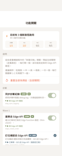
🟢 對齊功能開關(Debug)
settings-debug-flags
Swift:功能開關列表頁:頁首 summary card(啟用數 + Wave on/total 統計格)、說明區(兩段說明文字 + 紅色重置全部按鈕)、依 Wave 分組的 flag 行(risk/status/graduated badge、路徑 dot 指示、rawValue monospace、Toggle 或已畢業 seal 圖示)。
缺口 0 項
- (無差異)
⑪ 外場 / 聊天 / iPad 🟢3 🟡4 🔴0
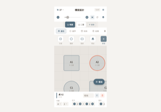
🟡 小差平面圖編輯器
floor-designer
Swift:SharedFloorDesignerView(透過 POSFloorDesignerView 代理)。主體 FloorDesignerView(ChefsMateShared)包含:① 導航標題列(樓層 Menu:building.2 + 樓層名 + chevron.down + 中置「樓面設計」標題 + WxH monospaced 徽章 + 格子設定按鈕)。② 頂部工具列(minus.circle.fill 縮小 + ZoomSlider + plus.circle.fill 放大 + arrow.left.and.right.square 適應寬度 + arrow.counterclo
缺口 1 項
- 物品選擇區「新增」工具按鈕:Swift 在填色背景(selectedCategory.color.opacity(0.8))上疊加一層虛線圓角邊框(StrokeStyle(lineWidth:2, dash:[4]));Flutter _addToolButton() 只有填色背景(primary.withValues(alpha:0.8)),缺少虛線邊框 overlay,視覺稍有差異。
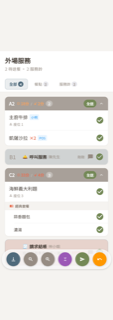
🟡 小差外場送餐
floor-delivery
Swift:FloorDeliveryView: Header (外場服務 + N待送餐·M服務鈴) → 篩選標籤(全部/餐點/服務鈴 + count badge) → 時間軸(送餐卡 FloorDeliveryCard + 服務鈴列 FloorServiceRequestRow 交錯) → 底部懸浮工具列(滑到底/縮小/放大/收合/全部送餐/恢復)。送餐卡:深色 header bar (桌號 + 雙等候時間色階 + 品項數 + 全送 + 收合) + 展開品項列表(套餐組標題 + FloorDeliveryItemRow)。服務鈴列:桌號 + emoji + 類型 + 客人名 + 自訂訊息 + 已回覆(藍
缺口 3 項
- 服務鈴列「已回覆」指示器與 reply border:Swift 用 Color.blue / Color.blue.opacity(0.3);Flutter 用 StitchColors.primary(#4F6A7B,暗石板藍)。視覺色調略有差異(純藍 vs 暗青),不影響結構或語義。
- 恢復(undo)按鈕:Swift 只在 undoStack 非空時才顯示;Flutter 靜態版本無條件常駐顯示橘色 undo 圓鈕,gallery 種子資料無法模擬條件隱藏。
- 底部工具列背景:Swift 使用 .ultraThinMaterial(毛玻璃半透明),Flutter 使用 Colors.white.withValues(alpha: 0.82) 白底高透明度近似,材質質感略有差異。

🟢 對齊客戶訊息列表
chat-list
Swift:對話列表:導航標題「客戶訊息」+ 右上角未讀總數紅色膠囊、搜尋列、四個篩選膠囊(全部/進行中/未讀/已關閉,含計數 badge)、LazyVStack 對話列(頭像首字圓圈、名稱、未讀紅點、時間、最後訊息預覽含「你:」前綴、未讀數膠囊)、inset 分隔線、空狀態。
缺口 0 項
- (無差異)

🟡 小差客戶對話
chat-detail
Swift:NavBar: center=customerName(headline)+phone(caption/textSub), right=ellipsis.circle menu (close/reopen/call). MessageList: LazyVStack on StitchColors.background. Bubbles: system=centered capsule (secondaryAdaptive bg, caption1, textSub); customer=gray-left (secondary bg, senderName caption2 above, t
缺口 1 項
- More-menu icon: Swift uses SF Symbol 'ellipsis.circle' (three dots inside a circle outline). Flutter uses Icons.more_horiz (plain three horizontal dots, no enclosing circle). The circle outline is visually absent in the render.
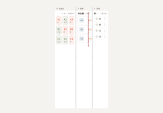
🟢 對齊iPad 三欄工作區
ipad-triple-panel
Swift:iPad 橫向三欄並排工作區:左「主控台」(40%)、中「廚房」(30%)、右「外場」(30%),每欄有圖示+標題的淡灰標題列,兩條可拖拉分隔線(6pt 寬、三條抓取線、雙擊重設比例、拖拉時顯示藍色預覽線)。
缺口 0 項
- (無差異)
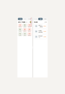
🟡 小差iPad 雙欄工作區
ipad-dual-panel
Swift:UIKit DualPanelHostController: two UIHostingController panels side-by-side separated by a 6pt DividerView (pan to resize 25–75%, double-tap resets to 50/50, spring anim on release, blue preview line while dragging). Each panel = DualPanelContent: tab bar (HStack spacing:2, bg Color(white:0.96)=#F5F5
缺口 1 項
- Left-panel tab bar overflows by 11 px at the default 50/50 ratio — Flutter overflow yellow stripe clearly visible in the screenshot ('RIGHT OVERFLOWED BY 11 PIXELS'). The three Expanded tab chips collectively exceed the panel's pixel width on this device frame. Swift uses natural-width tabs + trailing Spacer (no overflow). Fix: reduce minimum padding or font size inside _tabChip, or switch to non-Expanded flexible sizing with a trailing Spacer to mirror Swift's HStack + Spacer() behaviour.
🟢 對齊iPad 側邊欄
ipad-sidebar
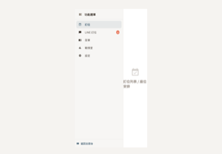
Swift:左側 Sidebar(260px/64px 收合)含:header(sidebar icon + 功能選單 + Divider)、5 個 tab 按鈕(訂位/LINE 訂位/菜單/戰情室/設定,active 高亮 + accentColor,LINE 未讀 badge 紅色 Capsule 展開右側/收合右上角)、Spacer、Divider、底部返回主控台按鈕(rectangle.split.3x1 + accentColor)。右側依 activeTab 渲染子 View。背景 Color(white:0.97)。
缺口 0 項
- (無差異)